Sneak Peek

Here is a sneak peek of things to come in my blog.  Having completed the near complete gut-job of removing my daughter's kitchen, leaving most of the walls and floor, the rest removed, I will share a few pictures.

A $5 piece of wood found in a bin at Rockler's.  With a bit of routing for the edges and to prepare a space for Rare Earth Magnets, a handy knife holder has become one of the most useful additions to the "new" kitchen.

A $5 piece of wood found in a bin at Rockler's.  With a bit of routing for the edges and to prepare a space for Rare Earth Magnets, a handy knife holder has become one of the most useful additions to the "new" kitchen.

The wood for the shelves was chosen for its "character", since the underside of the upper shelves would be visible, we chose the most distinctive side to face down.

The wood for the shelves was chosen for its "character", since the underside of the upper shelves would be visible, we chose the most distinctive side to face down.

With the absence of a real lighting expert, we had to rely on what we had and who was available.

With the absence of a real lighting expert, we had to rely on what we had and who was available.

Hazel Nut proved to be willing to help at every opportunity.

Hazel Nut proved to be willing to help at every opportunity.

For the Love of Horses

Last month, we visited historic Leesburg, VA, and toured one of the early plantations rich in history, and very inventive in ideas still practiced today.  We began our tour in what was the Carriage House, built in 1903, nearly 100 years after the planation was established  by George Carter.  The plantation was originally built in the Federal/Georgian style, but Carter renovated the house in the 1820s to reflect the more “modern style” of the day, Greek Revival.

Oatlands Plantation

Oatlands Plantation

It was the Carriage House that held the most fascination for me.  It was our first stop, and it was the site of the visitor center.  The carriage house was a later improvement to the plantation, and I was impressed with how well the horses were treated.  The building was well built with heavy plank doors; the tenons extended through the styles for a fit that would last a thousand years, I think, however, it appears that there was a resident mouse that has created its own entrance.

I was studying the tile floors and taking pictures when one of the ladies in the gift shop pointed out the same tiles were in the walkway; had I seen them, she asked.  The walkway was the path for the huge draft horses that worked the plantation, leading from outside into the horse stalls.  The thick tiles, made of  local clay, were a typical rectangle shape, albeit a bit larger that a traditional brick of today.  The bricks in the walkway were not laid in the typical fashion showing the broad side of the tile, but instead were planted deep, so to speak, with only the short end exposed, adding strength to the tile.  No wonder they have held up so well.

The tile that bordered the washing area for the horses was perforated, and there is a gentle slope toward the center to a drain.  I think the horses were groomed in style.  Furthermore, each horse had its own stall and every stall had a window!  Now that was some forward thinking.

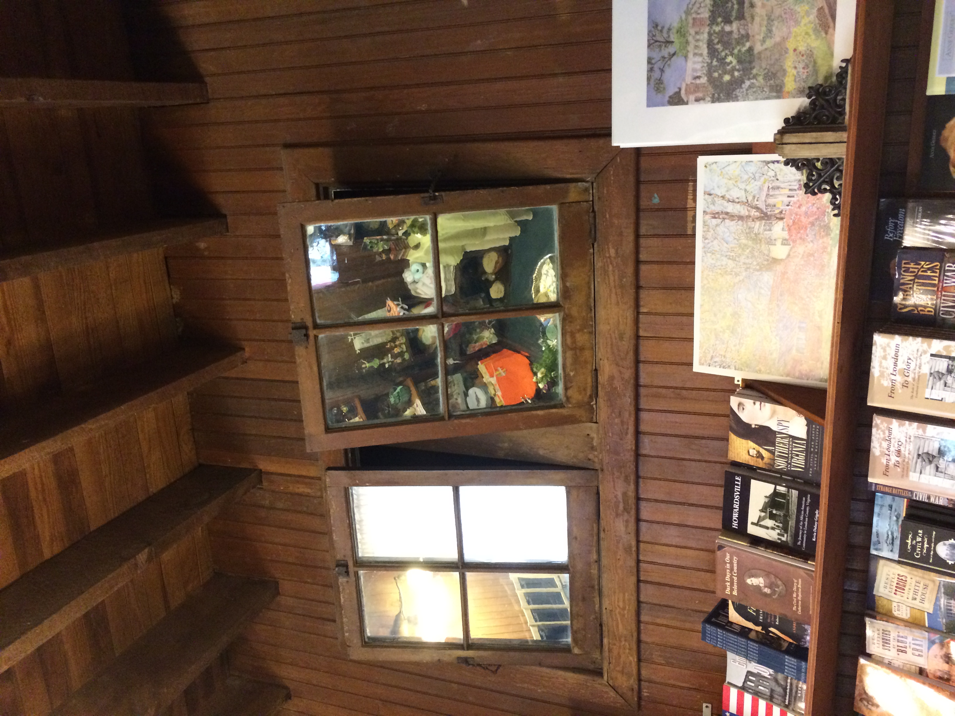
One of the things that I found most interesting, was the birthing room, now part of the gift shop.  The birthing room had two over two transom windows; instead of plain glass each pane was a mirror.  When the transom was open, it angled the reflecting mirror so that the birthing mare could deliver in private, but the caretakers could watch the birth and be at the ready in case there was need for intervention.  The window-mirrors served two purposes: one, to add much needed fresh air and two, provide a viewing station for the caretakers.

It took a farm boy friend of ours to suggest an answer to our question about the curious wooden structure attached to the wall, near the cast iron water pipe.  The structure had what looked like little shelves near the base of a three-spoke-like structure.  The shelves slide out, and the three structures can feed into one.  Apparently this feature was for three different types of grain that could be regulated by pulling out the “shelves”, allowing grain to flow into the center section.  I surmise that different horses required different diets, and this was the most efficient way to deliver the various grains.  The construction really was a work of art and for its day, I’d say, was very clever.

Today, the carriage house is host to many activities that continue to support this fine old plantation.  It offers afternoon teas, and people can hire the Carriage House for bridal teas and receptions of all sorts.  It is a beautiful old plantation, and it demonstrates how to keep history alive, and still stay current for more than two hundred years.

Another Family Project

 
Before

Before

After

After


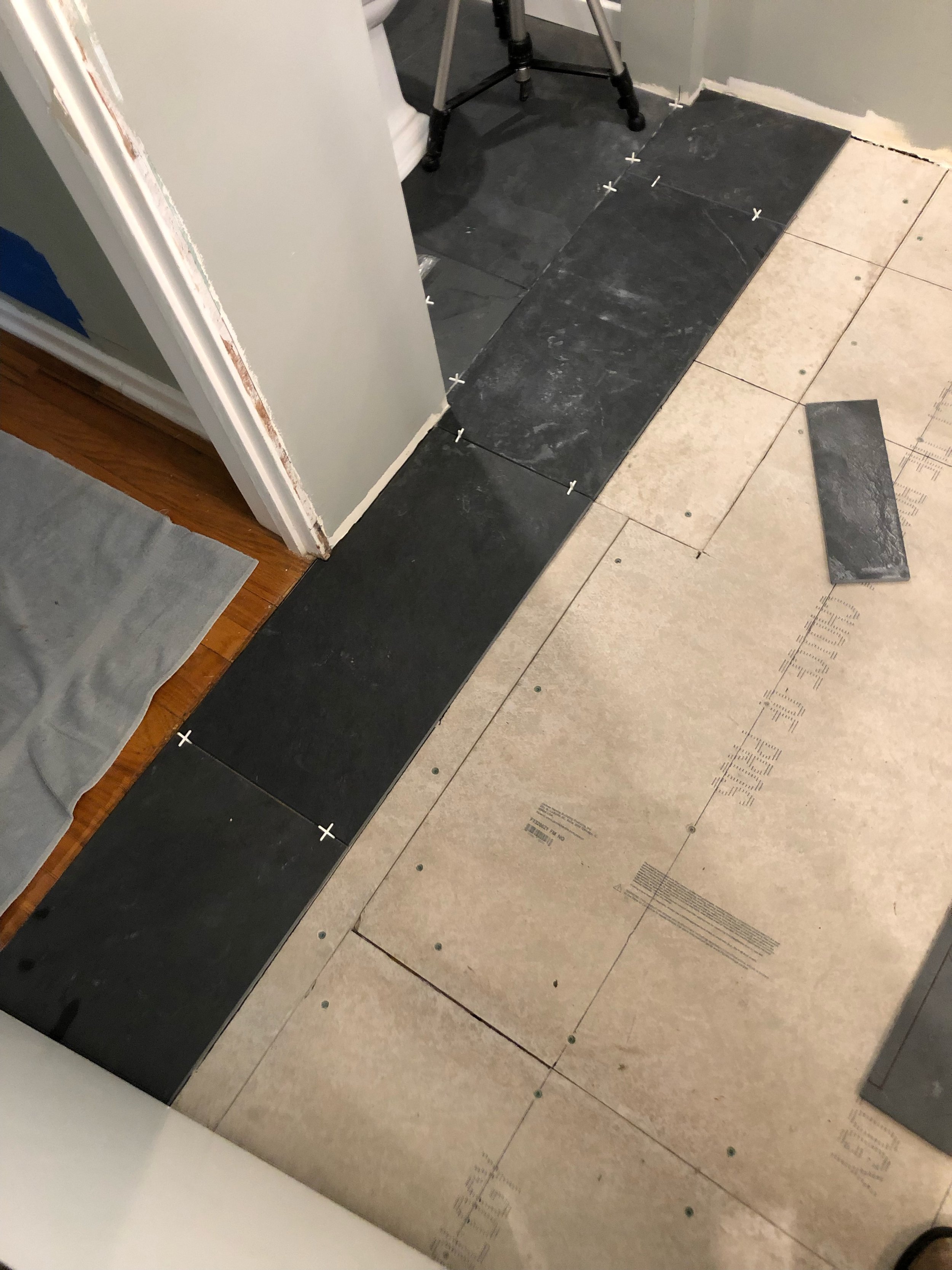
This article could be called “how to install a slate floor in the kitchen and laundry room, or what our family did over the Christmas holiday.” Like most families, we have some holiday traditions. Of late, our traditions could be titled, “House Crashers, the Holiday Edition— Year Three.”

Several years ago, our daughter’s house needed a new roof; and our visiting son wanted to try his hand at roofing—again. He bought his sister her own pink tool belt and matching hard hat. Last year, dear old dad was finishing the master bath, which included tile; this project was another one on which our son wanted a refresher course— with the addition of building a new fence. This year, the task was to remove old kitchen flooring, and replace with a ton of slate—-hohoho, oh what fun we had.

The first day was very rewarding. Demolition is usually a fun time; and with all hands on deck, we weren’t disappointed. Watching brother and sister work together as adults was its own reward— the bickering, of their childhood and teen years was gone; they were a team!

We finally uncovered the original 1930s linoleum floor in an Arts and Crafts pattern. Seeing the original flooring made more sense of the odd, green back splash tile; that is another project— not sure it will be a holiday one, though.  

Over the decades, there had been at least three floors laid, so getting down to the original was pretty exciting; it was like an archeological dig. Finding the odd nails used to secure the more recent subfloor was quite an experience; well, the removal of them at least, was quite an experience. There were hundreds and hundreds of them, and each one had to be pulled out using a rocking motion with channel lock pliers. So many nails and suddenly so few hands on deck!

Next was leveling the old sagging floor. We used a common leveling compound, a semi-liquid substance that seeks its own level and hardens to concrete. For the most part, this worked fine, and we moved onto matching sub-floors of decades ago and new construction, and adding some new plywood. That done, the backer-board went down, more leveling and then finally thin set and tiles.

Our daughter chose a natural slate. The pieces are gaged, meaning the underside is level, but the upper or show-side have the natural characteristics of slate. The look is very textured, which is what she wanted. The pattern she chose was a herringbone using 12X24 tiles. Larger tiles are in some ways easier to use; at least they cover a greater area in a shorter amount of time, win-win, but they are heavy. Thankfully, we were not covering a banquet hall, only a modest kitchen and laundry/service porch area.

Once the tile was secured, we used a stone enhancer to bring the slate up in color— that is to make it more black, less dark grey. We used a very thin grout line and used a very dark charcoal grout to lessen the contrast between the tiles and grout, giving the floor a more cohesive look.

We centered the herringbone on the back door, since that is the sightline from the living and dining rooms. Next, we’ll have to get the baseboards replaced, but that is another day. It is a beautiful floor and will last a lifetime, at least mine!

Not a job for the feint of heart or back, that is for sure; we did meet some new friends with this exercise: Aleve and Aleve PM.

Contrast Adds Drama

While it is true that high contrast will add drama to a room, it is wise to consider how you use contrast.  A painted accent wall is fairly easy to change should you decide you cannot live with the drama the color created, but a floor or a tiled backsplash or shower enclosure is a bit more complicated in terms of expense and time invested.

When you are considering changing something more permanent in your home, like flooring and counter surfaces as well as backsplashes and tub/shower enclosures, try less contrast.  You will be living with these changes for a long time and a classic surface in these areas will serve you better.

Think of all the homes built in the early to mid-20th Century; for the most part, these homes were built with hardwood flooring.  Over the years, as wall to wall carpet became popular, these floors were covered with soft, colorful carpet.   Today, that carpet is considered undesirable and old fashioned.  Carpets in older homes are routinely being  pulled up, exposing those now treasured hardwood floors.  If the wood is in good condition, a simple sanding, staining and fresh coat of polyurethane to preserve its beauty for another half century or more.

Choosing a new color for the floor will be important and fairly permanent.  While it may be tempting to add or stain a border or pattern, think in terms of long term use and how you will feel about such a contrast as a wide, light or dark border verses a solid-colored floor.  An exception to this rule, would be if the floors cannot be successfully refinished, but can be painted instead; then I’d say, go ahead and paint a fun harlequin pattern or boarder.  While the traditional black and white pattern is always popular, you can use softer colors for less contrast, like shades of grey or spa colors like blues and greens; even shades of beige would be a calm and peaceful color combination. 

Tile and natural stone is an expensive and fairly permanent surface for kitchens and baths.  Tempting are the bright colors and fun patterns, but again, consider how long it will be in style, staying classic is wiser.

Unless your home is clearly in a particular style like a Spanish Revival or Spanish Colonial, the use of colorfully patterned tiles might be a bit risky.  Adding cute “accent tiles” to a kitchen backsplash will date your renovation very quickly and reduce its value at resale time.

If using these colorful and playful tiles is something you have your heart set on, use them in less permanent ways.  For instance you can make tile trivets and hang them on the backsplash to add some personality without risking the need to tear it out once you tire of it.

When considering high contrast, think about how long you will live in this home and consider the home’s style.  High contrast will give you high drama, but you can enjoy soft contrast too and it is often easier to live with in the long term.