Stripes Add Interest


 I find that stripes add interest in many different mediums throughout the home, from pillows to upholstery and carpet-- I don’t mean just area rugs, but broadloom carpets as well.  Stripes can be bold, or soft and subtle by using neutral colors, and still add interest and energy to your living space.  Not only will they add to your decor, but they tend to hide a myriad of traffic wear and just about anything else an active family can inflict.

The infusion of stripes to a decor of either plain or printed fabrics helps break up the predictability of solids and patterns--adding a bit of a surprise, if you will.  Keeping color as the unifying element will give your room the cohesive look that you need for good design.

Stairs lend themselves to stripes in a most interesting way.  Take a plain, straight staircase, mostly hidden from the public rooms, usually closed in with walls on either side, essentiality a hall straight up to the upper living quarters. Carpeted stairs are always more quiet, and should be considered with an active family.  By adding striped carpet to just the staircase, you can easily be coordinate two disparate carpet styles or colors, if the stairs connect to carpet on both upper and lower levels.  Of course, if you have hardwood, tile or laminate in the room at either end of the stairs adding, carpet of any sort will not be much of a design issue.

Adding a striped carpet will give your room an energetic boost while keeping the appearance of stairway wear and tear to a minimum.  Keep in mind that carpet warranties do not cover hallways and stairs; so adding striped carpet will disguise the wear and tear an active family imposes on such such a highly used traffic area.

Subtle stripes on walls is another easy decor addition that can be achieved with either wallpaper or paint.  Painting wide vertical or horizontal stripes using the same paint color or similar but changing the finish to one set of the stripes will give a room a touch of interest without overpowering the rest of your design.  Of course if bold is what you are after, that too is easily achieved.

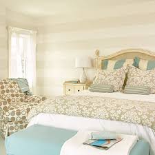
Striped bedding, drapes, shades and upholstered pieces can  give a room the same energy as flooring and wall color.  Always vary your scale when mixing prints, and stripes and remember to keep your colors related in some way for a cohesive look.

Contrast Adds Drama

While it is true that high contrast will add drama to a room, it is wise to consider how you use contrast.  A painted accent wall is fairly easy to change should you decide you cannot live with the drama the color created, but a floor or a tiled backsplash or shower enclosure is a bit more complicated in terms of expense and time invested.

When you are considering changing something more permanent in your home, like flooring and counter surfaces as well as backsplashes and tub/shower enclosures, try less contrast.  You will be living with these changes for a long time and a classic surface in these areas will serve you better.

Think of all the homes built in the early to mid-20th Century; for the most part, these homes were built with hardwood flooring.  Over the years, as wall to wall carpet became popular, these floors were covered with soft, colorful carpet.   Today, that carpet is considered undesirable and old fashioned.  Carpets in older homes are routinely being  pulled up, exposing those now treasured hardwood floors.  If the wood is in good condition, a simple sanding, staining and fresh coat of polyurethane to preserve its beauty for another half century or more.

Choosing a new color for the floor will be important and fairly permanent.  While it may be tempting to add or stain a border or pattern, think in terms of long term use and how you will feel about such a contrast as a wide, light or dark border verses a solid-colored floor.  An exception to this rule, would be if the floors cannot be successfully refinished, but can be painted instead; then I’d say, go ahead and paint a fun harlequin pattern or boarder.  While the traditional black and white pattern is always popular, you can use softer colors for less contrast, like shades of grey or spa colors like blues and greens; even shades of beige would be a calm and peaceful color combination. 

Tile and natural stone is an expensive and fairly permanent surface for kitchens and baths.  Tempting are the bright colors and fun patterns, but again, consider how long it will be in style, staying classic is wiser.

Unless your home is clearly in a particular style like a Spanish Revival or Spanish Colonial, the use of colorfully patterned tiles might be a bit risky.  Adding cute “accent tiles” to a kitchen backsplash will date your renovation very quickly and reduce its value at resale time.

If using these colorful and playful tiles is something you have your heart set on, use them in less permanent ways.  For instance you can make tile trivets and hang them on the backsplash to add some personality without risking the need to tear it out once you tire of it.

When considering high contrast, think about how long you will live in this home and consider the home’s style.  High contrast will give you high drama, but you can enjoy soft contrast too and it is often easier to live with in the long term.