Pocket Doors vs Barn Doors

IMG_9262.jpg
CIMG2207 copy.JPG

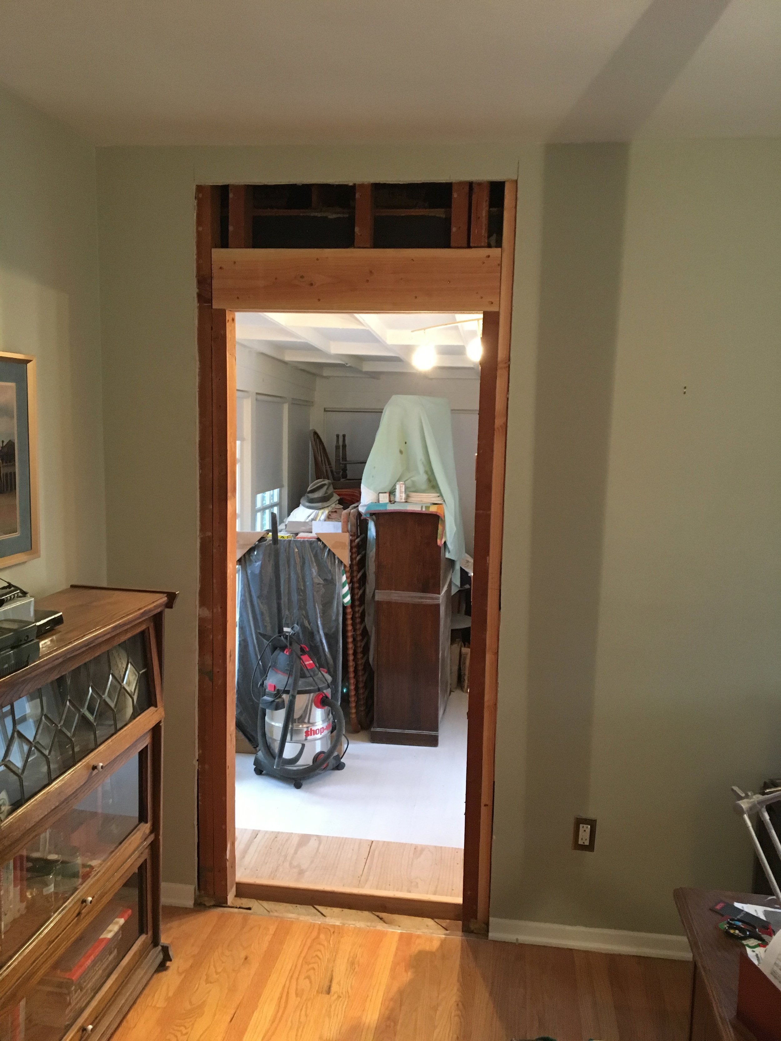
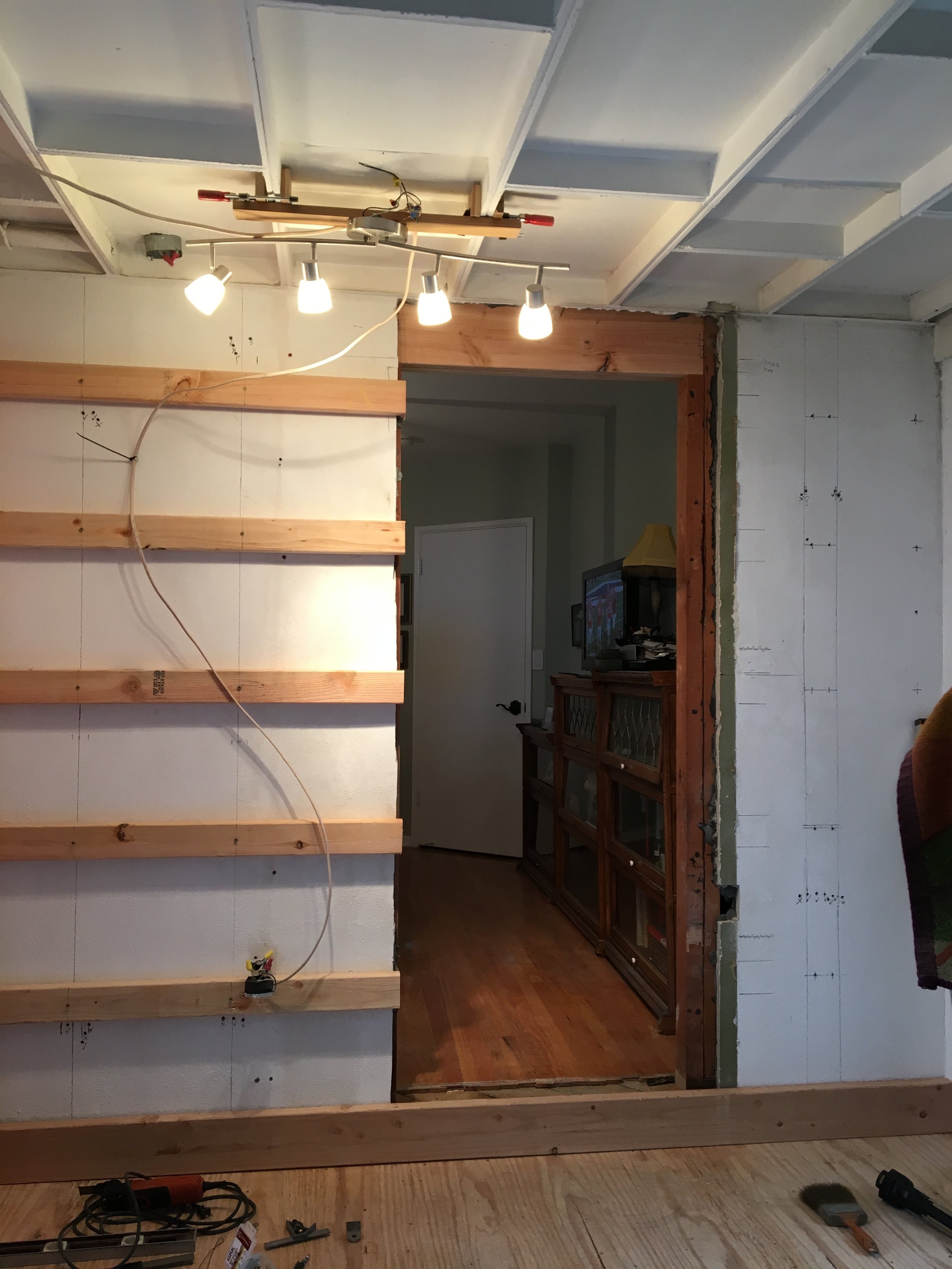
The recent remodel of the 1930s kitchen and bath included closing off a couple of doors, one was in the kitchen.  The second door to be closed off was in the dining room and lead to the front bedroom.  We felt this door was misplaced from the beginning, probably someone mis-read the plans and put the door on the south end of the wall when it should have been at the north end.  This placement meant the front bedroom had two doors that were in constant conflict; one went to the hallway and the other to the dining room.  Additionally, the front bedroom had a door or two, or a window on every single one of its four walls.  Not great for furniture placement.

IMG_8567 copy.jpg

We had talked for years about removing this door and opening the wall at the north end of the same wall which leads to the hallway, bathroom and two bedrooms.  With the removal of the door in the kitchen this would be the only way to the hallway from any room, making all the rooms more useful, since each room would have more wall space for counters or furniture.

While we were under construction, it seemed prudent to take care of this issue at the same time.  Smartest. Move. Ever. 

Pocket doors have been around almost from the beginning when we graduated from one room to many rooms, and wanting privacy.  It makes so much sense, takes up no space and offers privacy without the inconvenience of having to allow for a door to swing into a room.  I remember the huge oak pocket door that separated our living and dining rooms in our first home, a 1917 Craftsman Bungalow, now that was a heavy door!

IMG_4589 copy.jpg

We did consider using the now very popular barn door installation, but there are considerations to make with this type of door.  It would most likely considered a piece of furniture or artwork, since it would be “on the wall” when opened, and always on display, as opposed to be inside the wall, and out of sight.  In this case it could have been partially hidden behind the china cabinet when opened, but it just felt too heavy and cumbersome in such a small space; while a pocket door would simply disappear.  The homeowners leave the pocket door inside the wall most of the time, closing it only if they wish to close off the rest of the house: two bedrooms and two bathrooms.  This wall actually bisects the house, which is nice if you want privacy from the non-public rooms, opening it only for access to the hall bathroom.

My handy husband and father/father-in-law of the homeowners, took the door from the front bedroom and filled in the hole where the door knob had been and made it a wee-bit wider to fit the new pocket door opening; which comes as a standard size in a kit.  He filled in the holes, sanded, primed and painted it until it looked like new.  Using one of the original doors kept the house authentic.  Now the house functions like it should have more than eighty years ago.  It was a smart move and both the dining room and front bedroom are more functional.  Another win/win for the little house, now to get some flooring to finish where the wall had been.

Sneak Peek

Here is a sneak peek of things to come in my blog.  Having completed the near complete gut-job of removing my daughter's kitchen, leaving most of the walls and floor, the rest removed, I will share a few pictures.

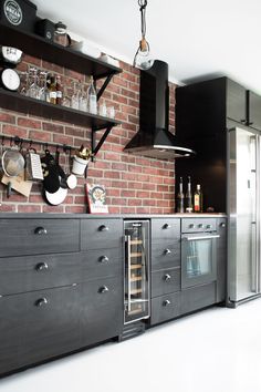
A $5 piece of wood found in a bin at Rockler's.  With a bit of routing for the edges and to prepare a space for Rare Earth Magnets, a handy knife holder has become one of the most useful additions to the "new" kitchen.

A $5 piece of wood found in a bin at Rockler's.  With a bit of routing for the edges and to prepare a space for Rare Earth Magnets, a handy knife holder has become one of the most useful additions to the "new" kitchen.

The wood for the shelves was chosen for its "character", since the underside of the upper shelves would be visible, we chose the most distinctive side to face down.

The wood for the shelves was chosen for its "character", since the underside of the upper shelves would be visible, we chose the most distinctive side to face down.

With the absence of a real lighting expert, we had to rely on what we had and who was available.

With the absence of a real lighting expert, we had to rely on what we had and who was available.

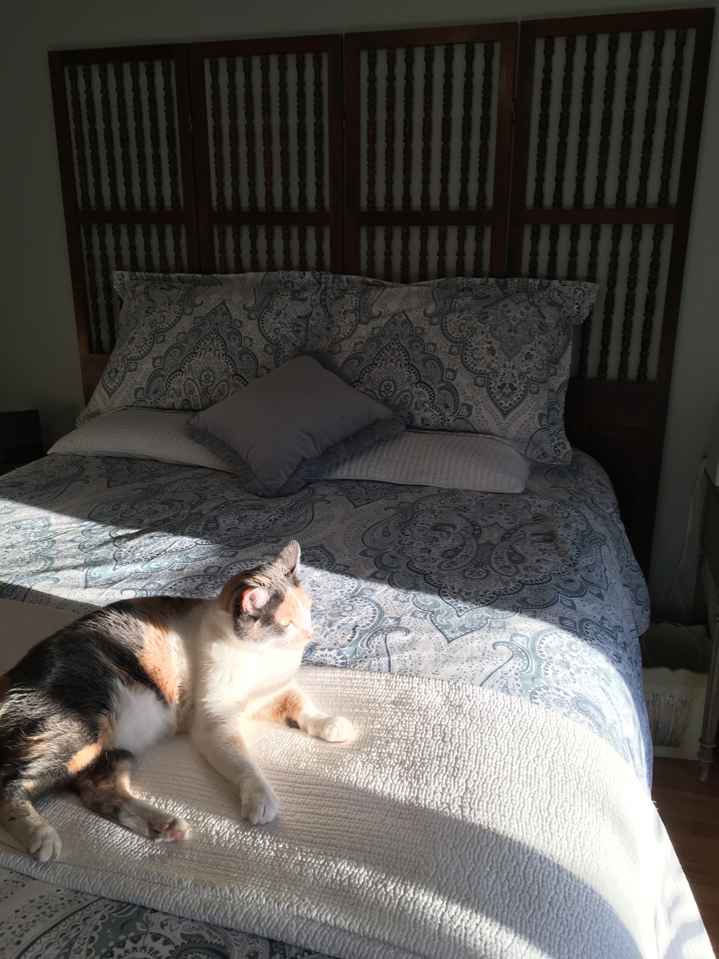
Hazel Nut proved to be willing to help at every opportunity.

Hazel Nut proved to be willing to help at every opportunity.

Bathroom Remodel:

When the Open Concept is Taken Too Far

IMG_8321.JPG

We started the hall bathroom remodel several weeks ago, a bit backwards perhaps— with a door.  Years ago, I bought an antique leaded glass door with the hopes to use it as the door for the hall bathroom, since it was so pretty and the bathroom was not.  My main objection to the hall bath was that whomever added it on, placed the toilet smack in the middle of the doorway, with the door open, it was not a pretty sight, especially since you see it from the kitchen.

My handy hubby, the engineer did another stretching job to the door, it was wide enough, but not long enough to cover the opening and hang from the sliding mechanism.  Then, there was the task of filling holes from door knobs and dead bolts.  And finally, hours of filling, sanding, priming and painting!  A substantial header needed to be put in place to hold the heavy duty sliding mechanism to allow us to hang the door.

Next up was what to do with the leaded glass that offered lots of beauty, but little privacy needed for a bathroom.  I thought an antique mirror behind the leaded glass would offer the necessary privacy, and thought it would be interesting from the kitchen/hall side.  As for the bathroom side, I am planning on a sheet of wallpaper that will compliment the bathroom, or maybe blackboard paint.

The actual tear down of the bathroom or demo to the studs was next.  The house was built in 1938, when a 2X4 was exactly that, not today’s shaved down version.  When the bath was added, this factor was not taken into consideration, hence uneven walls with odd bulges and waviness.  My engineer decided the only way to fix it was to strip it down to the studs.  Besides, the reason for the remodel was to move the toilet from, “front and center”, to under the window and move the sink to where the toilet had been for a more pleasing view.

This bathroom was “carved” out of what we expect was a “laundry area” and stolen bedroom closet space on the common wall behind where the toilet was placed.  We decided to take more out of the closet area, by removing some of the upper storage, that had been left with the previous remodel.  We wanted the new sink area to have full ceiling height, rather than the lowered ceiling that was from the previous remodel.  This would allow for a nicer lighting fixture and a more spacious feeling in this tiny three quarter hall bath.

The demolition of the surrounding walls, left the toilet standing in my husband’s office; pretty convenient for him, but lacking privacy all around!  He is wasting no time getting the remainder of the closet walls reframed, thus closing in the bathroom from the office side, at least.

Next up will be further demolition of the shower tile and floor tiles.  Floor tiles have been ordered along with a mirror/medicine cabinet. Stay tuned.

IMG_1104 copy.JPG
IMG_1106 copy.JPG
IMG_3622 copy.jpg
IMG_8325.JPG

The Art of Stretching A Door

It’s been a long time since I posted anything about the guest room makeover, so long that I forgot I had started to write about it back in January of this year.

It has been a long five months in the making…but it is finally habitable— not completely finished, but livable at least.

One of the primary things that needed to be installed was a door to cover the opening for privacy between the guest room and my husband’s office.  We actually found an entry door back in November and decided it was just the ticket for our sliding door. Except the door was a standard 6’8” door and the opening was standard for a typical inset door, to cover the opening it needed to be s-t-r-e-t-c-h-e-d for full coverage.

My handy husband began cleaning up the door that is 80+ years old, by filling the door handle, lockset and deadbolt openings, sanding down much of the eight to ten layers of paint and adding about three inches to the bottom of the door.  I think he used poplar to extend the door; this was done by cutting and glueing pieces together to make the extension.  Once the door had been made to the exact size to hang over the opening and offer complete coverage, top and bottom and side to side, it was nearly ready for priming.  

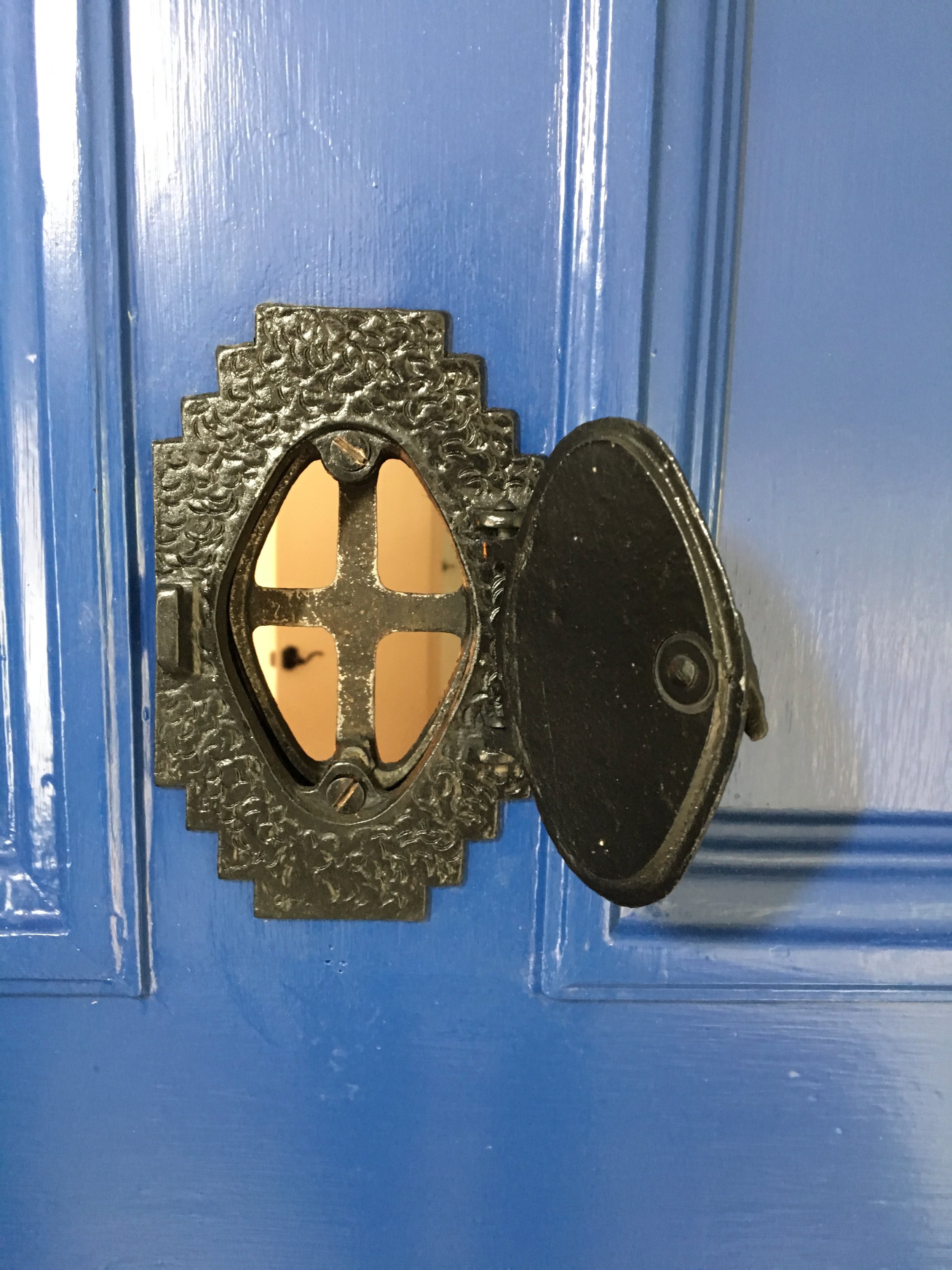
But, before that, the speakeasy needed to be recessed so it would pass on the wall side of the guest room when it was completely open and not scar the wall.  My husband needed to chisel out the stepped configuration of the speakeasy to match and make the depth flush with the exterior of the door.

Now, it was ready for some heavy duty priming.  I used an oil based primer, since it offers the best coverage and would prevent any ghosting of previous colors.  Priming and painting took time, since both sides of the door needed to be painted, and with this winter and all the glorious rains, it was a challenge to get good drying time.  I wanted the door painted two different colors, since one side would face my husband’s office, it would be white to match the trim in that room.  On the guest room side, I decided that I would set it up like the entry door it had been in its glory days.  Painting it the same color as the sleeping alcove, a deep blue, against a cool, pale blue on the walls outside of the sleeping alcove, allowed it to stand out on its own as a showpiece.

I was fortunate to have had a small armoire, complete with hanging space, shoe rack, shelves and drawers; perfect for the space on one side of the door.  The other side of the door was large enough for some kind of furniture piece, and went back and forth about what would be the most serviceable.  I finally found a small dresser that looked more like an entry console, perfect!  It is small enough not to crowd the available space and large enough to be serviceable for storage of sheets and towels, until guests come and then it serves well for their clothing storage; one guest gets the “closet” and one gets the dresser, they share the hanging space.

With a generous platform serving as the step down, it feels more comfortable than a small awkward step, and there is an electrical outlet in the riser for plugging in an additional lamp by the chair.

Flooring, operable windows, and at the air conditioning unit will be the next big expenses.  Guests say the room is quite comfortable, except that the newest cat can open the door!  So, maybe it is not so private after all. 

Christmas Project Breakthrough

Christmas Project Breakthrough    

I feel as though I won the Christmas Lottery!  This year, the holiday project was at our house instead of at our daughter’s house.  When we first looked at this house, we found it a bit quirky.  Fortunately for us, the quirky characteristics caused many potential buyers pass on it, leaving it for the more adventurous.

We have not yet figured out what the original intent was for the add-on room, our project room.  We believe the room was added on about 25 to 30 years ago, based on materials used.  The do-it-yourself person who built the room did not have the qualifications to do a really good construction job, especially with the electrical system.  The room has seven good quality, floor to ceiling windows, all dual glazed, but none of them open for ventilation.  The exterior door, off the driveway, is the only access into the room; fortunately there is a screen door for fresh air.  This room was not good for not much more than a sunroom or storage, which is how we have used it.

However, we always intended it to be a guest room, knowing we would need to upgrade many aspects of it.  Most important was constructing direct access to the rest of the house from the room, without having to go outside walk down the driveway and enter the house through the back door.  Having an accessiblebathroom without having to go outside was primary.

The plan was to cut a door through a wall in the second bedroom aka my husband’s office.  We could see there had been a window in that wall prior to building the add- on room; therefore, there was an existing header in the wall.  That wall was the logical place for a door.  The window was simply walled over from the inside and left exposed on the guest room side, though disguised by a make-shift closet.  

The biggest problem was cutting through 1938 stucco and about an inch of concrete.  I was grateful to have a much younger person doing the cutting: our gallant son who was willing to do the very, very dirty work.  Once the cuts were made and the wall removed, we all finally could imagine the finished project.

Sadly, there is much left to do before I can jump in and share with you all the fun decorating plans I have; but be patient, it will all be recorded here for you in the coming weeks, and months.

There is a need for only one step down from my husband’s office into the newly created guest quarters.  After some discussion, we agreed that making the step into a full platform would serve best.  First, my husband would not have to level the pebble path that ran under the window before the room was added, and I would not have to deal with an awkward step into the room.

We purchased an old, entry door from Pasadena Salvage, as the door that would offer the necessary privacy for our guests.  I opted for a Speakeasy door to add to the interest and maintain the quirky quality of the house.  This door will slide on barn sliders for access to the rest of the house.  Stepping down from my husband’s office into the room and onto the platform will offer very secure footing.

Currently, my husband is working on the electrical system in the room; there will be plenty of outlets, USB ports, and lighting options.  Having the platform, will afford an outlet or USB port in the riser, wires running under the step, and no encroachment on the very limited wall space, since two sides of the room are all windows.   

Progress beyond the electrical will be fun to share; I am expecting the door hanging to be a whole new story—stay tuned.

Fractured Beauty

A year or so ago, a tiny pebble struck the French door at my daughter’s house.  Sadly, the pebble was thrown by a weeder the gardener was using— he was devastated. Naturally, my daughter was equally devastated, but for different reasons.  She knew what getting a new door would entail; the gardener knew it was a costly accident for which he was ultimately responsible.  

When I saw the door, I couldn’t get over how beautiful it was, the sun was glinting through it, refracting light like a prism.  “We can use this”, was my first comment. After her initial shock, my daughter could see it too, but we were far from being able to implement the idea into the backyard design at her house.  

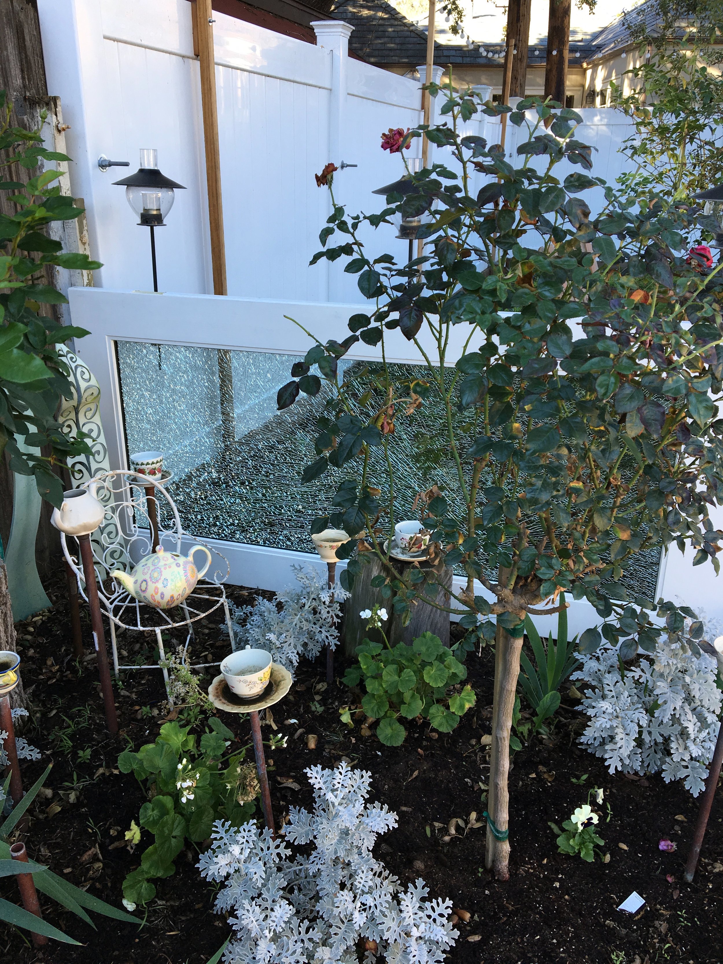
Once the door was replaced, the fractured door was stored.  I knew the door was still “somewhere”, but out of sight out of mind.  When my daughter suggested we use it in my Alice in Wonderland Garden, I thought it was a brilliant idea.  Yes, we could lay it on its side and it would act as a barrier between Alice’s garden and the grassy area behind the patio; effectively cutting off a short cut for the dogs between the two spaces.  Since the door was a standard six foot eight inches, the space between the posts that separate the two outdoor areas was perfect.  Transporting the heavy door would fall to the men in the family; they got it loaded onto the rack on top of my husband’s SUV and they unloaded it at our house.  My husband got it screwed into the posts and it was secure.  

During one of my daughter’s “scavenging for doors” trips, on a tip from a friend, she managed to pick up a four windows painted a funky yellow-green color, knowing they would be useful.  Two of the windows are a great backdrop on the fence in Alice’s garden, and the other two fit side by side by the French door, in the second eight foot section of the space separating the two outdoor areas.

Alice’s garden is finally coming together.  Once I got a pair of white tree roses and a shorter pair of red roses, Alice’s garden was beginning to take shape.  The Queen of Hearts was the beginning of the Alice Garden, a gift from my brother-in-law and sister-in-law, and grew from there.  The gate I was planning to use against the back fence— when I thought I would link old doors to create a solid barrier against the snarling dogs living behind us— is now in Alice’s garden.  We had to put up a solid fence between the yards to save our sanity and do it in a weekend, so the gate was free to be reused…again.  I love finding new uses for old things, but I fear it is the bane of my husband’s existence; thankfully he continues to tolerate my crazy ideas.

This exercise proves that we can make good use of seemingly “broken” items.  Finding new uses, is my gift.  I remember suggesting to people who lost all their crystal in the 1994 earthquake, to save the shards and pieces, fill a glass cylinder and make a lamp out of the glass and cylinder.  The light shining down through the glass would allow the beautiful fine crystal to sparkle and shine again, just in a different capacity.  There are so many possibilities!

Decorating With A Cat

Statistics show that most of us have pets of some kind, and cats and dogs top the list; however, there are a myriad of other pets to consider in a household.  How to decorate around some of the necessities of having pets can be challenging.  Some pets require much more thought than the usual couple of cats and dogs; snakes, small rodents, small horses and the occasional arachnid may need special attention.  Fortunately, other than cats and dogs, most other pets fall outside of the public rooms in most homes.

My downsized situation required me to find a suitable place for a litter box, not an unusual problem for cat caretakers.  Having no separate laundry room made my litter box issue a problem.  The bathrooms were not really large enough to share suitably, leaving only my office— yuck!  What could I do?  I was pretty pleased to get he box out of view, for the most part; however sitting at my desk, I could see it. I put a privacy curtain along one side of the desk, offering the cat and myself a little privacy.
This solution worked for over a year, but the litter scatter was still an issue for me, and vacuuming multiple times a day was not in my game plan.  I took a look at Pinterest and found a simple solution using an inexpensive IKEA wicker basket idea.  I had a wicker basket under the picture wall of my office, but didn’t want to cut a side away.  Besides, its construction was not conducive to cutting a hole in the side.  The IKEA basket was perfect for this application.  Using tin snips or garden clippers, my husband and I cut away the wicker on one end of the basket leaving the heavy framework in place.  We used heavy plastic and lined three sides of the basket and the floor, inside, clipping the upper edges of the plastic to the upper edges of the wicker.  I found a mat at the pet shop that was intended to capture the litter from the cat’s paws as she left the enclosure, and this mat helped cut down on the tracking of litter, while the liner inside the basket took care of the scattered litter.  Cleaning and scooping the litter is so much easier now; I just lift the lid and have full access to the box, whereas before, I had to clamber under the desk and wiggle the box out to remove it, and that put me way too close to the contents to be happy, I find this much easier to deal with.

My ideal would be have a “Catio”, a term I heard from a local veterinarian; I was intrigued.  I have a perfect area just outside my office that I’d love to have screened in for just that purpose.  It would require a door leading out to the back yard, but oh my, the cat would L-O-V-E to have her own, semi-outside space; and I would love not having the litter box inside my office.  Of course, we would need a small cat door in the wall for her to access the “Catio”, but that seems minor to me, as I would not be the one cutting a hole in an outside wall.  

Maybe someday, this dream will come true for the both of us.  Next, I wonder if Sophie would use the area box in the cold of winter; maybe if I had a heated pathway for her to walk to the litter box—but then, maybe I’m getting a little carried away, or not.

Copper: A Natural Element In Decor

There are many beautiful natural elements, but copper with its rich reddish-orange color strikes me as a perfect element for fall.  It mixes well with the reds, yellows, golds and oranges of the fall season.

Copper is a pure metal found in nature.  It was the first metal used by humans circa 8,000 B.C.   It has been used in the making of weaponry and jewelry and vessels.  In relative recent times, copper is found in such common products as plumbing, roofing, electrical conductors, computers, and currency in the form of our humble penny.

In design, copper has many uses and is selected for its rich “coppery” color.  When paired with cool colors on the color wheel, copper is a beautiful accent.  It is often used in jewelry and paired with turquoise, a color to which copper naturally turns when exposed to the weather.   Some of the most beautiful architectural icons are marked with the rich patina of copper, including cathedrals and our own Statue of Liberty.

Copper as a design element, is more common than you may think.  I took a turn through my house and gathered all things copper, just to see what I had.  I knew I had a copper bowl that had belonged to my mother-in-law, a small cup like vessel that belonged to my dad, but I was surprised to find lots more items than I originally remembered. There were small things like earrings, a bit of copper wire wrapped around some beach glass, a beautiful vase my husband brought back from Turkey decades ago.  I also have several copper kettles.  Copper is such a good conductor of heat that it has been manufactured into cooking vessels.  My first set of pots and pans were copper bottomed and I loved keeping them gleaming—that is until toddlers came into my life.  I also found that I have copper vessels for plants.

It is no wonder that we have such a love of copper.  Besides its beauty and usefulness, it is actually an element in our bodies, and is essential to our overall good health.

There many uses of this beautiful metal.  In the engraving art, copper was used in print making.  Copperplate is the name of a specific handwriting style: Copperplate..  As a calligrapher, in my early days, I used this script with a split pen nib, in order to get the thick and thin stokes of the ancient style.  However, I always think of the beautiful color and how it fits into our everyday life. 

Cozy-Up Fall Decorating

I know the official start of fall is still nearly a week away, but there is something about the beginning of September that makes me ready to nest and prepare for fall. The cooler mornings and evenings, the warm days, and the falling leaves signal a change in the season, albeit a slight change here in our mild climate.

When September arrives, I begin pulling out my fall decor and setting them around the house, ready for the seasonal change. There are so many little things you can do to decorate for fall that are simple and easy.  Just changing out the sofa pillows is a good start.   Adding some soft throws in warm fall colors adds that extra layer of warmth you need in the evenings.

I like decorating for fall as if were a holiday in itself.  I can put out some pumpkins and orange lights around the entry for Halloween closer to the end of October, but fall decorating lasts until after Thanksgiving for me; it is such a satisfying time to decorate.  Addinga fresh fall door mat and a wreath at the front door signals to all who enter that warmth awaits them.

Keeping fresh flowers in your home is another great way to enjoy the colors of the season.   Some scented candles conjure up a batch of cinnamon cookies baking, even if baking is not your forte.

Decorating fireplace mantles is a tried and true tradition, but if you do not use your fireplace for fires, at least not this early in the season, don’t forget the hearth and firebox.  The mantle can take second seat for a change.  Add some candles and logs to your firebox for fall interest.  Birch logs are always pretty and show up nicely against the dark interior of the firebox.

Little touches can make a nice, quiet impact in your home and hopefully will enhance your home as a sanctuary for you and your family as well as friends.  A trip to your favorite home store will give you plenty of inspiration.  You can easily match your purchases to your budget before you shop if you have made an assessment of your existing collections.  Once things are stored for a season, I forget what I have and what has been discarded.  Some things need discarding once I open the boxes again.  I keep my new purchase in check by reviewing what I have decided to use again.  Sometimes, just visiting seasonally decorated shops is tonic enough for me to resist spending a small fortune on more fall decor.

An Entry With A Little Pizzaz

This is a good news, bad news dilemma.  The good news was that we have an actual entry in our little house, something that has always been important to me.  I suppose it is because my father always wanted one in our 1950s house, but by then entries were given up in favor of more living space elsewhere in the home.  We had a covered front stoop; and eventually, my father enclosed it and made a formal entry to our little home.  

The bad news regarding our entry was that it was tiny and dull.  It was painted the same color as the living room— a color that I love; but since the entry was so small, I felt it needed to have a little pizzaz.  In truth, as you enter the house, you never see the only wall that does not have a door in it or an opening to the living room.  

As I sit in my office and look out across the living room, I can see into our dining area with windows that give me a view of our mountains, and into the living room, as well as the one wall in the entry where the only interest on the wall— the three brass pipes that give tone to the door bell, but they are not very interesting.

What to do?  I pondered this question for a short time, thinking paint is the quickest solution to my problem; but I was not certain that paint would be enough.  I remember, when we first saw the house, I was thinking I could put a gatelegged table in that space.  Then I realized there was no space for any furniture, paint would have to be enough.

This thought left me so unsatisfied that, I began thinking around my depth problem and decided I would find an image of an entry table and tape it on the wall to trace it with a chalk pen.  After finding the perfect table for my aesthetic, I took it to a photocopy store and had the staff enlarge the image.  This proved not so simple, since the aspect was not quite right.  I ended up taking the image the photo shop provided, and cut the legs crosswise and extended them to table height—voila!  Since I did not expect the table to be taken seriously, its rangy legs were not an issue.

I used chalkboard paint on the wall and a chalk crayon to get the image onto the wall.  Actually, I had an artist friend come over and draw the outline, thinking that if I did not like it, she could draw something that would be suitable.  It turned out that I liked it, as it was, not perfect, and a bit whimsical.  

Entries are important in homes, and I have spent quite a few hours creating them in my client’s homes, when there is not a designated entry with traditional walls.  Entries can be “imagined” into rooms that open directly into a living space, by placing a large table to stop guests from simply walking all the way into a room upon entering.  A decorative screen can also be used to stop the eye from roaming about the family living space, and sometimes a bold paint color will serve to delineate an entry space.

An entry gives a homeowner a sense of privacy to anyone coming to your door, either invited or not.  Sometimes, a homeowner may not want to have a visitor actually enter personal living space, so an entry is a way to hold them to a more confined area, even from looking in from the outside.

I am so happy to have my little entry, and now I love it even more that it offers some interest to me and my guests, once they come into the house.  More likely, visitors will not see my little table until they leave; nevertheless it is more interesting than bland walls.

The Forty Dollar Make-Over

A forty dollar make-over may sound too good to be true, but a little can go a long way to lifting your spirit or giving you a fresh new seasonal look.

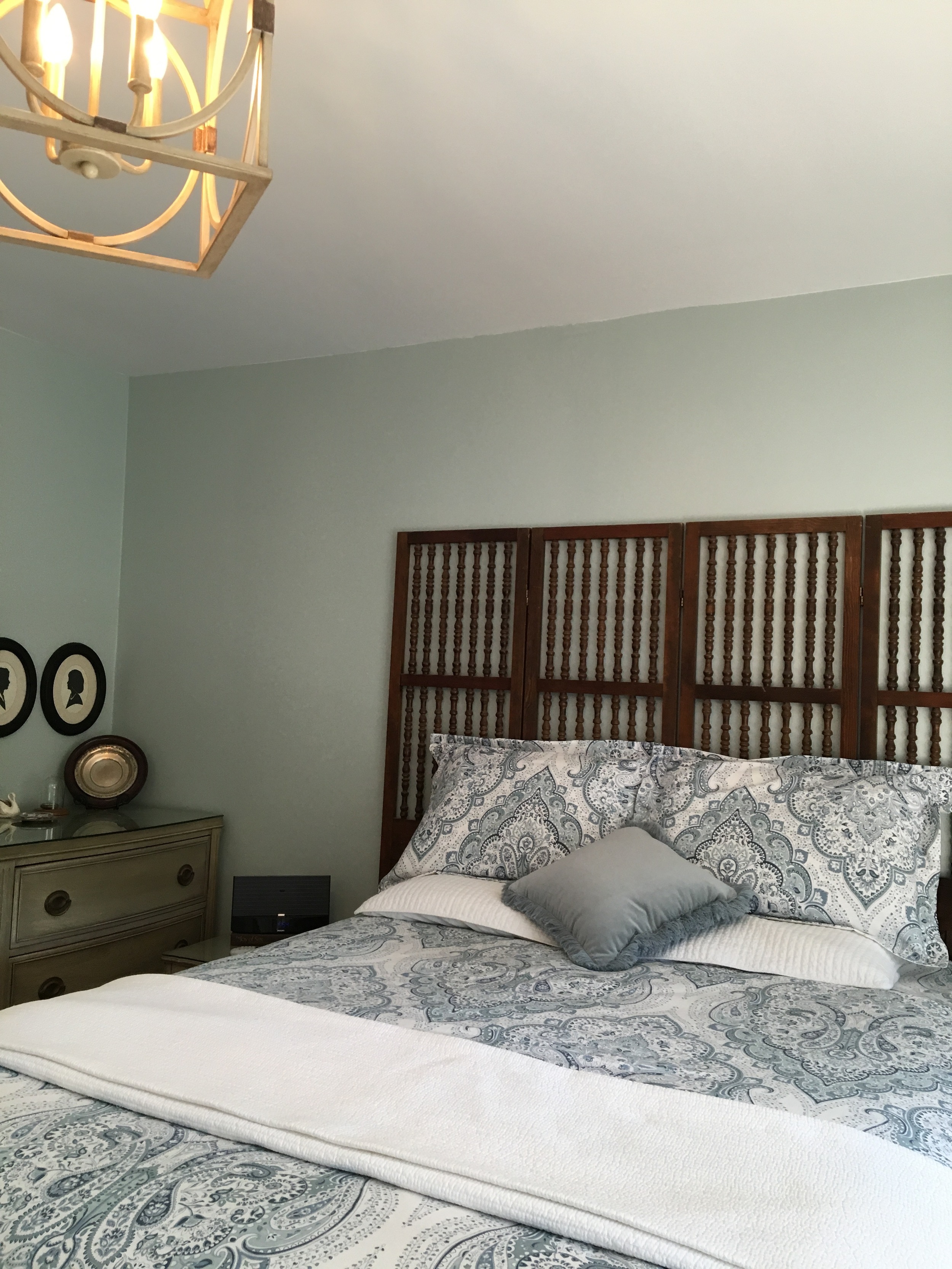
I doubt that I would have found my forty dollar duvet set had I made a special trip to find it.  Because I am often in home goods stores looking for things for clients, kids or myself, I was able to spot an appealing set that fit my color palette.  It made the journey more fun, and somewhat serendipitous.

Knowing your color palette helps you find accessories for your rooms that will work instantly for your space.  Far from being dull, your color palette will offer you great opportunities to make small or subtile changes and even seasonal changes that will coordinate with your decor.  

Living in neutrals helps the process as well, but do not think in terms of white or beige as being the only neutrals—far from it.   When I think of color, I have a huge spectrum from which to choose.  People not accustomed to color, tend to think in terms of primary and secondary colors only.  When I suggest green to clients, too often the first color that comes to their mind is grass green.  Primary and secondary colors are great in some situations, but to live in them would be difficult for most people.

Just about any color is more sophisticated if it is toned down with to a grayer tone, i.e. a gray green is easier to live with than grass green; and there are lots of great options to bring a pop of color into the room with the use of textiles, art and painted furniture.  Making accent color changes is also much easier when using a grayed down version as the main color.  A gray green room, will come to life with accents of poppy red or chartreuse.  A bold bright blue or yellow, are also great choices.

Building a room from your color palette by adding layers of colors through artwork and textiles is surprisingly easy when you find art and textures that you love.  If you have been collecting fabrics or art, you will probably recognize a pattern.  You will find that much of your collection is similar in color.  You are drawn to certain colors, look at your wardrobe, besides the basic black, you will no doubt find you are drawn to warm or cool colors, and those will be colors you are most comfortable wearing.

I knew I wanted something brighter than the soft, gray, green of my bedcover.  It was a solid, textured piece, and I was just a bit tired of it.  I still like it and will use it; but for summer I wanted something brighter, with a white background, but it had to be washable.  I live with two cats and one of them loves to rest on the bed during the latter part of the day, so washable is important to me.

Finding your color palette is daunting for many, so calling in a professional will save hours of frustration, and hopefully open your eyes to many more options— like accent walls.  It’s all about proportion, intensity and light.  You must know the light you live with in order to feel comfortable with your color choices.  Do not be afraid to try different color combinations and patterns.  Remember when it comes to paint color, it’s only paint; you can change it.

Hall Cabinet Update

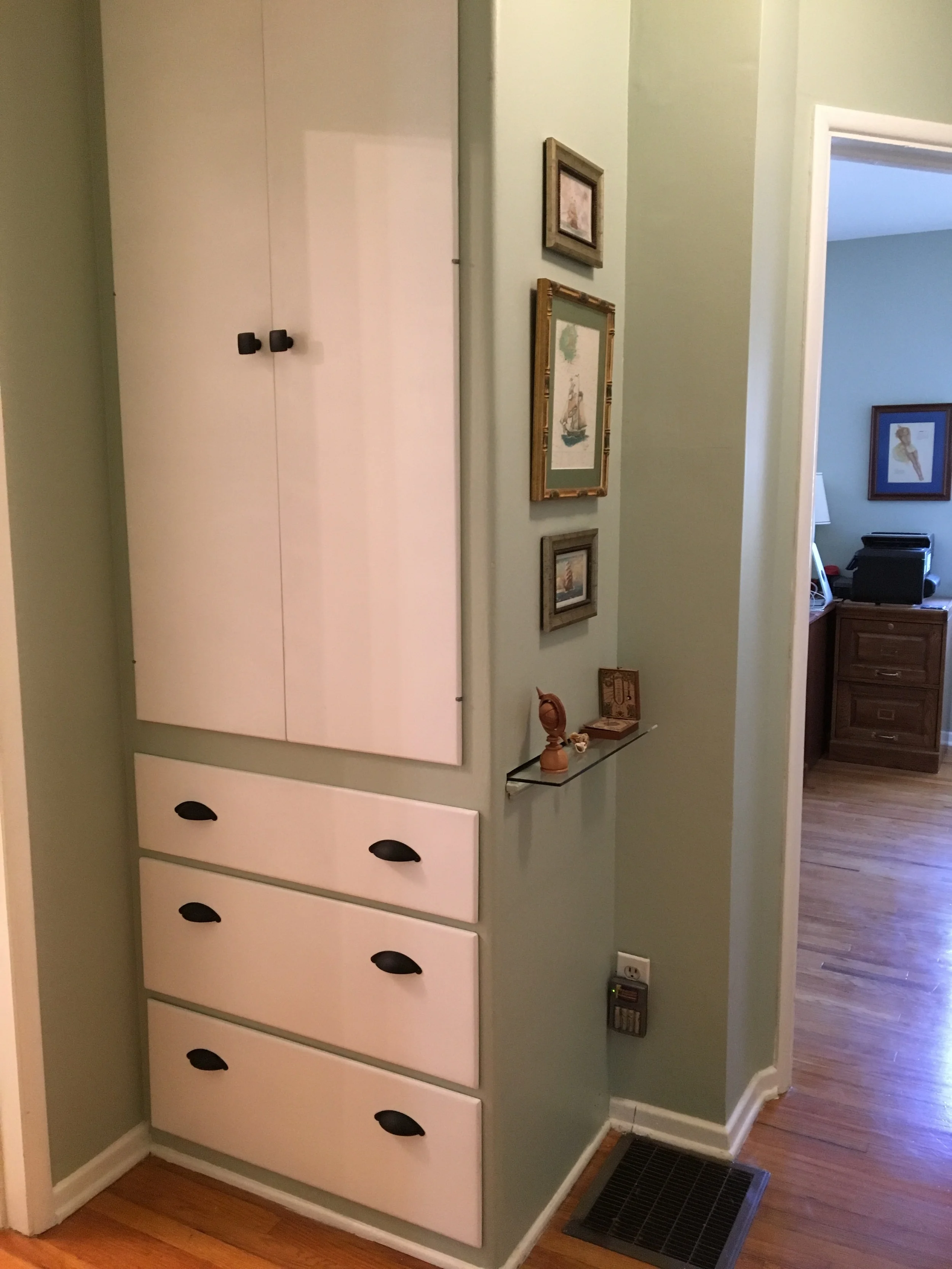
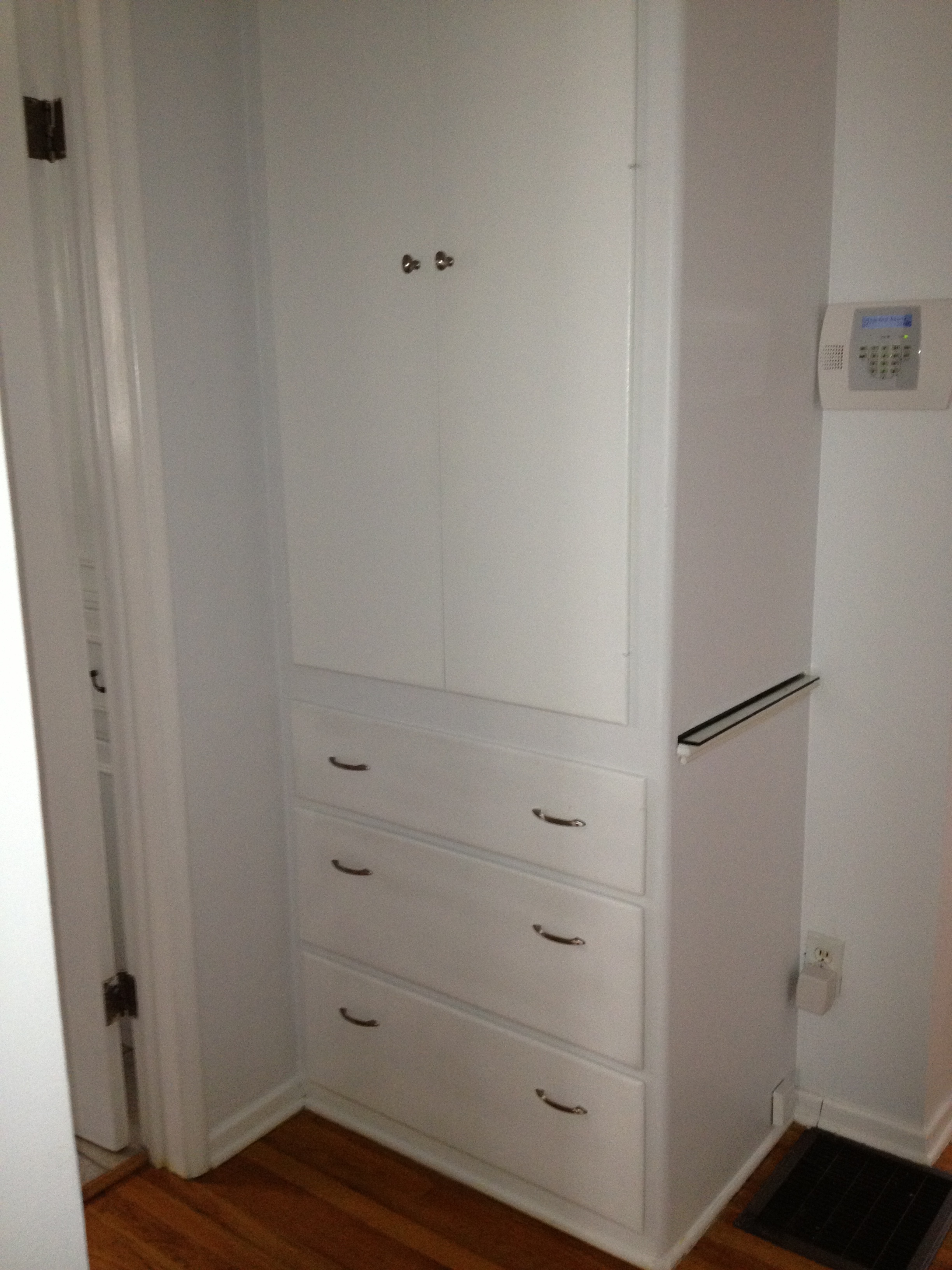
After, the peeling, sanding and priming of the hall cabinets, the spraying commenced.  The spraying was easy since the door and drawer fronts were simple and flat.  I love the smooth texture over the old stippled roller texture.  New hardware in a sharp contrast and better scale than the old, made a big difference.  The old 1938 hidden hinges turned out nice and I like the nod to the past.  Here are a few before and after photos.

IMG_5901.JPG

Cabinet Project Progress

Sometimes I feel as though I am not making any progress with my many projects.  I imagine that many people experience feelings of failure because they never get a project started.  It is best not to look at a project as a source of failure from the start; no one would ever get anything done.

The mud-room/laundry at my daughter’s house is a case in point.  While it is almost finished, it is not quite there.  Painting the doors was a long, hard lesson, but a valuable one in many ways.  The project started when we, The Hammond Amish Construction Company (Amish, only in the sense that we are an all hands on deck kind of family when it comes to projects), tore out layers of old vinyl and linoleum flooring and laid slate tiles throughoutthe kitchen and into the newly expanded mud-room/laundry.  

The following holiday, we gathered again; and the guys got the IKEA cabinet boxes installed over the refrigerator and stackable washer/dryer, and alongside both appliances.  The semi-custom-built doors were made by a company that specializes in door fronts for IKEA boxes.  The next phase was the painting of the doors, which meant I needed to get the paint room— aka the Dexter Room— assembled, thanks to handy husband/dad.  Once that had been accomplished, I needed the sprayer to go on special, which happens twice a year, the spring and fall.  Come spring, I was ready;  or so I thought, as described in an earlier article.  The painting started off badly, because I was sold the wrong paint, the most difficult paint with which to learn this new process.  

However, we overcame the problem; and the doors are finished and installed—well most of them.  No project can go flawlessly; IKEA did not provide all the hinges we needed, or perhaps the correct ones for the two longest pairs of doors.

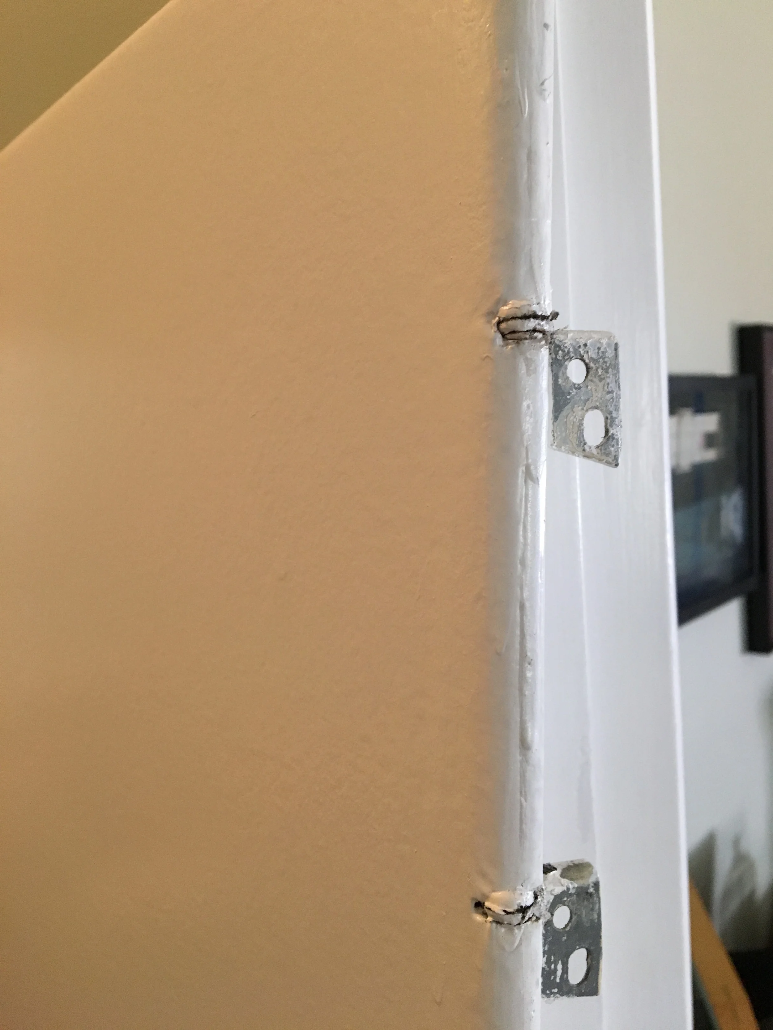
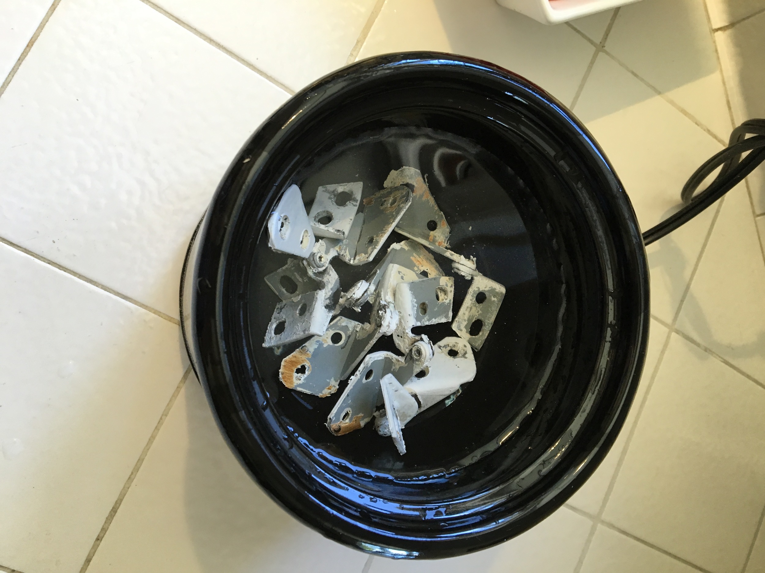
You may be wondering if I would ever be willing to tackle cabinet doors again. The answer is yes.  I began removing some cabinet doors from my hallway.  They are hung with 1938 hidden hinges, and are really interesting and minimalist for the day.  I think preserving them is important, but my hands may not agree.  I managed to get most of the screws out; but after watching my husband struggle, I knew I was in over my head trying to remove them myself.  Once the hinges were free, I began soaking them in a mini-crock-pot to help remove the years of paint.  

Next, I began the removal of the latest layers of paint,  starting with the latex paint that had been put over the older oil based paint from 1938 up to probably the 1960s.  I ended up peeling off the latex paint like peeling off wallpaper.  Most of it was stuck on with static electricity, I think!  Sadly, there was plenty that stuck like glue and I was able to remove it with an orbital sander.  Oddly, there were only about three layers of different colors, the latest being white latex.  I do not think the doors were ever primed.

I will remove all the door fronts from the hallway cabinets with the old hidden hinges and in the hallway where the laundry is, for preservation.  The door fronts are simple and flat.  There is not much to work around, other than getting the channels free of old sticky paint so the cabinets will close properly.  However, I am rethinking doing the same in the kitchen.  There are only a few doors fronts, and they have had newer hinges in place of the old original ones;  I may have new doors made, and save myself the aggravation of stripping the old ones.

I really do enjoy refreshing, refinishing and re-purposing old things, but there comes a time when I, like many other people, must decide if the effort is worth the work.  I will keep you posted on the project.  

As for my daughter’s mud-room/laundry cabinet doors, they look great and she is very satisfied with them; she still needs to get some cabinet hardware, which she will want to coordinate with the kitchen when those cabinets are replaced—and so it goes, a never-ending process to bring new life to old things.  

There is always a price to pay when considering refurbishing or replacing; you do need to weigh the pros and cons of any project, as well as judge your skills and the time that it will take to make it aproject well done.

The Beginnings of Design

We can debate when design began; but for me, it began with the creation of earth.  Whether you subscribe to the Big Bang Theory or more traditional Creation theories, design was there at the beginning.  As soon as man made an appearance on earth, evidence indicates that he made his mark on design.

So much of our current design ideas come from nature and culturally from what is available in a given region.  Man’s cave drawings and his need to create music are shown in every culture and place on earth where man has existed.

My inspiration for this topic began at a breakfast place when I saw a wallpaper in the distance and could not discern the pattern other than a stylized block print.  Upon closer inspection, I saw that the artist had used the silhouette of a rooster in a single color on a white background that formed a square pattern.  From a distance, it looked like a slightly elaborate geometric pattern, when in fact it was a simple barnyard animal.  Very clever!

We have just returned from Phoenix where we visited the Musical Instrument Museum, a fascinating place that will interest people with musical leanings or for those who only play the radio.

What fascinated me was the evidence of ornamentation on even the most simple and sometimes crude musical instruments from the earliest times.  It is not surprising that design for the sake of design improved and became more intricate and elaborate as cultures became more sophisticated.

One thing that did surprise me, was the presence of bagpipes in nearly every culture.  While the Scots are known for their bag- pipes, many cultures had some variation of the instrument.  Drums, pipes, horns and stringed instruments were found throughout history and again, every culture seemed to have some variation of them.  The use of animal skins as instruments, and as decoration was as interesting as the music they played.

Recognizing natural and ordinary objects that surround us helps us understand that art is everywhere. So many things can be interpreted as an art form.

The designs found on the musical instruments show us that making beautiful music is not enough; we need to make the actual instrument beautiful as well.  Sometimes, it is simply the form, like a violin with its sensual lines, that helps create the beautiful sounds, along with the particular wood and finishes that help the sound resonate.  However, I think most people would agree it is a beautiful instrument; it is used to play classical sounds or the fun, country fiddle sounds that make everyone want to move, clap their hands and stomp their feet.

Nearly everything that man touches shows signs of his ability tocreate design whether it is for function or simply for beauty.  We never would have reached the moon without design.  Without nature, it is unlikely we would have found flight possible; following the flight of birds and incorporating their form and aerodynamics is truly a thing of beauty and an undeniable art form.

Look around you and identify how art is in everything we use.  Man needs to express himself in artful ways, a most basic expression along with making music.